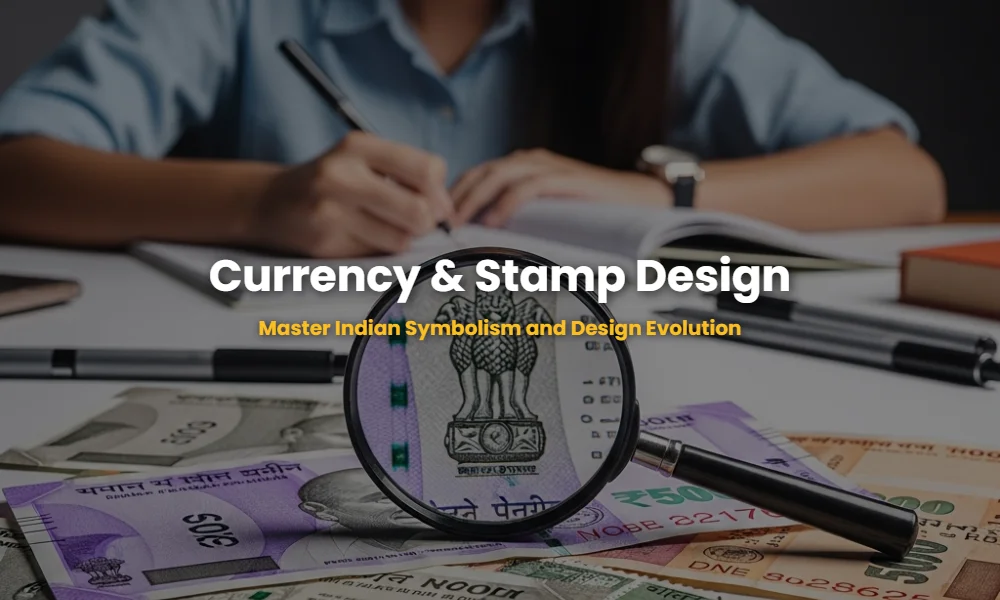
The Hidden Symbols Most Aspirants Ignore in Indian Currency
Indian currency design is not just about money; it is a meticulously crafted visual narrative of a nation’s identity. By decoding the symbolism of the Ashoka Pillar, the evolution of Mahatma Gandhi’s portrait, and the shift toward vibrant color palettes, NID aspirants can unlock high-scoring insights into visual semiotics and cultural communication.
🚀 Key Takeaways
- Understand the shift from the Mahatma Gandhi Series to the MG (New) Series.
- Master the geometric logic behind security features like the latent image.
- Identify the role of commemorative stamps in nation-building.
- Learn to analyze color psychology in modern Indian denominations.
The Evolution Secrets the NID Examiners Don’t Want You to Miss
The transition in Indian currency design represents a shift from colonial-era rigidity to a celebration of indigenous heritage and scientific prowess. The MG (New) Series, introduced in 2016, abandoned the traditional pastel shades for ‘Stone Grey,’ ‘Magenta,’ and ‘Bright Yellow,’ reflecting a modern, tech-forward India while maintaining deep historical roots.
For instance, the inclusion of the Swachh Bharat logo on the reverse of all new notes signifies a design-led nudge toward social behavior change. This integration of policy into daily visual artifacts is a prime topic for NID GAT (General Ability Test) questions.
| Denomination | Color Palette | Theme (Reverse Side) |
|---|---|---|
| ₹10 | Chocolate Brown | Konark Sun Temple |
| ₹50 | Fluorescent Blue | Hampi with Chariot |
| ₹100 | Lavender | Rani ki Vav |
| ₹500 | Stone Grey | Red Fort |
Why Your Ranking Depends on Decoding Postage Stamp History
Postage stamps in India serve as ‘miniature ambassadors’ of culture. From the first ‘Scinde Dawk’ to the modern ‘My Stamp’ initiative, the design evolution highlights shifts in illustration styles, moving from realistic portraiture to abstract concepts of globalization and digital connectivity.
Stamps are categorized into ‘Definitive’ (for regular use) and ‘Commemorative’ (limited editions). NID often asks candidates to analyze the layout, typography, and perforations of these stamps. A key design element is the use of bilingual text (Hindi and English), which balances national pride with global accessibility.
💡 Pro-Tip: The ‘₹’ Symbol Story
The Indian Rupee symbol, designed by D. Udaya Kumar, is a blend of the Devanagari ‘Ra’ and the Roman capital ‘R’. The two horizontal lines represent the Indian flag and the ‘equals’ sign, symbolizing economic equality. This is a classic NID question on logo design and semiotics!
5 Simulated Questions with 30-Second Ninja Shortcuts
Q1. Identify the motif on the back of the ₹2000 note and its significance.
Answer: Mangalyaan (Mars Orbiter Mission), representing India’s first venture into interplanetary space.
🥷 Ninja Shortcut: Use the “Big Note = Big Achievement” rule. The highest denomination features India’s highest scientific milestone.
Q2. How is the design of Indian notes adapted for the visually impaired?
Answer: Intaglio printing of shapes (Circle for ₹500, Triangle for ₹100) and bleed lines on the edges.
🥷 Ninja Shortcut: Look for “Tactile Typography.” If a question asks about accessibility, focus on physical textures (Bleed lines).
Q3. Which stamp category focuses on specific events or personalities?
Answer: Commemorative Stamps.
🥷 Ninja Shortcut: Commemorate = Celebrate. Regular = Definitive. If the stamp is ‘special,’ it’s commemorative.
Q4. What design element is common to all Mahatma Gandhi New Series notes?
Answer: The Swachh Bharat logo and the geometric grid patterns for security.
🥷 Ninja Shortcut: The “Clean India” glasses are the constant footer of modern Indian paper currency design.
Q5. Analyze the color logic of the ₹10 note.
Answer: Chocolate Brown, echoing the earthy, historical stones of the Konark Sun Temple.
🥷 Ninja Shortcut: Connect Color to Context. Stone Grey = Forts; Brown = Temples; Green = Nature/Sanchi Stupa.
Design Expert FAQs You Need to Ace the Interview
Why did the size of Indian notes decrease in the New Series?
The smaller size makes the notes more ergonomic for wallets and improves machine-readability for ATMs. From a design perspective, it reduces paper waste and aligns with international currency standards like the Euro.
What is the significance of the language panel on currency?
It features 15 languages, symbolizing the linguistic diversity and inclusive nature of the Indian Constitution. This information design strategy ensures every citizen feels represented by their money.
Still Confused about Design Symbolism?
Our experts have decoded over 15 years of NID Previous Year Questions to help you master these concepts. Don’t leave your ranking to chance!
💬 Chat with our Experts on WhatsApp (+91 9526806124)