Mastering Color Theory for NIFT: From Physics to Aesthetics
For any aspiring designer eyeing a seat at the National Institute of Fashion Technology (NIFT), color theory is not just a chapter in a book—it is the very language of design. Whether you are tackling the General Ability Test (GAT) or expressing your creativity in the Creative Ability Test (CAT), understanding how light and pigment interact is fundamental. In this guide, we will break down the complexities of color systems and provide you with an interactive tool to test your knowledge.
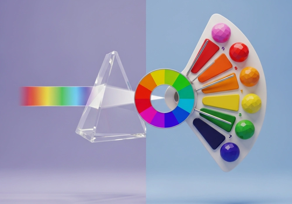
1. The Science of Light: Additive Color (RGB)
Color begins with light. Sir Isaac Newton first demonstrated that white light is composed of a spectrum of colors. In the world of digital screens, stage lighting, and photography, we use the Additive Color Model. The primary colors here are Red, Green, and Blue (RGB). When these three colors of light are mixed at full intensity, they create white light. This is why your smartphone and laptop screens are able to produce millions of shades by simply varying the intensity of these three light sources.
2. The Artist’s Palette: Subtractive Color (RYB and CMYK)
When we move from light to physical substances like paint, ink, or dye, the rules change. This is known as the Subtractive Color Model. In traditional art (and for the NIFT CAT), we use the Red, Yellow, and Blue (RYB) system. In professional printing, the Cyan, Magenta, Yellow, and Key (Black) or CMYK system is used. These models are called ‘subtractive’ because pigments absorb (subtract) certain wavelengths of light while reflecting others. When you mix all primary pigments together, you get a dark, muddy brown or black because almost all light is being absorbed.
3. Essential Vocabulary for NIFT Aspirants
To score high in the NIFT GAT, you must be familiar with these technical terms:
- Hue: The name of the color itself (e.g., Blue, Red-Violet).
- Value: The lightness or darkness of a color. Adding white creates a Tint, while adding black creates a Shade.
- Saturation/Intensity: The purity or brightness of a color. Adding grey creates a Tone.
- Analogous Colors: Colors sitting next to each other on the color wheel (e.g., Blue, Blue-Green, and Green).
- Complementary Colors: Colors directly opposite each other, which create maximum contrast (e.g., Red and Green).
Test Your Color IQ
Drag or type the correct words from the bank into the blanks below.
The additive color system uses as its source. In contrast, Red, Yellow, and Blue are the primary colors in the model. When you add white to a pure hue, you create a . Colors that are opposite each other on the color wheel are known as . Finally, the brightness or purity of a color is called .
4. Applying Color Theory in the NIFT Exam
In the CAT (Creative Ability Test), your choice of color can determine your ranking. Avoid using pure colors straight from the tube; instead, mix your own hues to show a sophisticated ‘color sense.’ Use complementary colors to make a specific part of your design pop (focal point), or use analogous colors to create a sense of harmony and calm. Remember, examiners look for your ability to use color to tell a story or evoke an emotion.
Expert Tip:
For the GAT, memorize the difference between Prang’s Color Wheel and the Munsell System. These are frequent sources of multiple-choice questions!Ready to Ace NIFT?
Get personalized guidance, access to premium mock tests, and resolve all your design entrance doubts with our faculty.
💬 Chat with our Experts on WhatsApp (+91 9526806124)