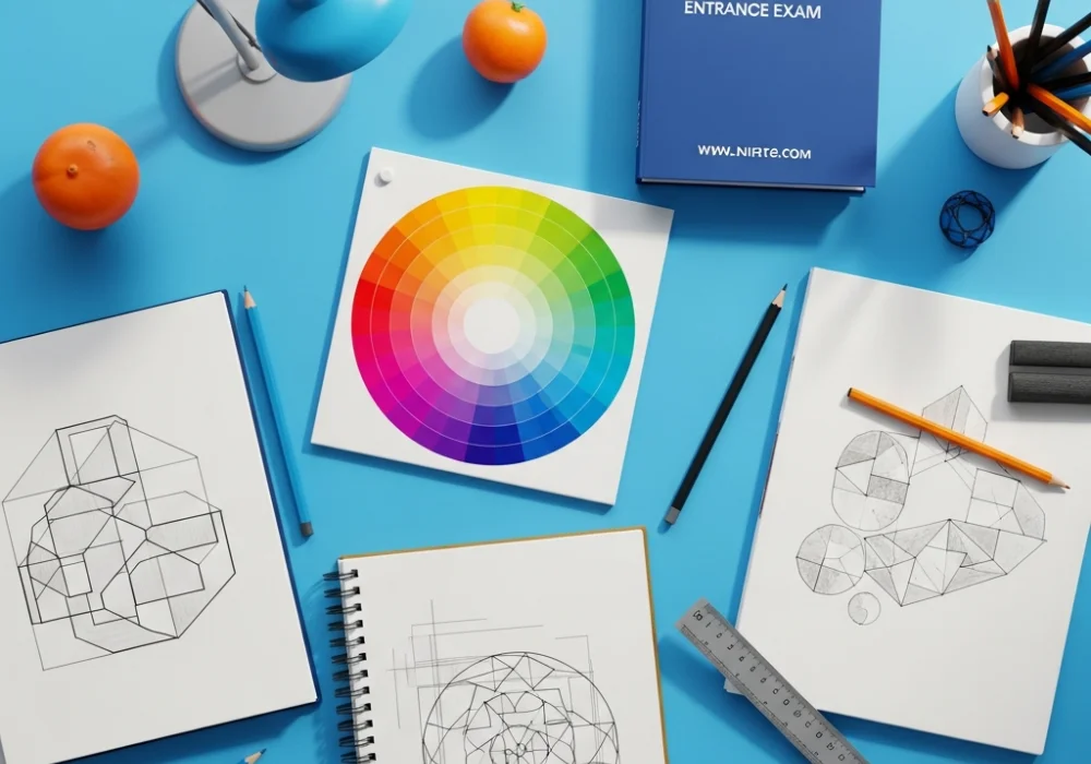
The Ultimate Interactive Guide to Design and Composition for NIFT Exam Success
The National Institute of Fashion Technology (NIFT) is the premier destination for aspiring designers in India. To secure a seat in this prestigious institution, one must master the Creative Ability Test (CAT). This segment of the exam is designed to evaluate your intuition, observation power, and most importantly, your grasp of design and composition. Whether you are aiming for B.Des or M.Des, the fundamentals of how you organize elements within a frame—be it a poster design, a mascot creation, or a comic strip—determine your final score. This blog post serves as a comprehensive study module, combining deep theoretical insights with an interactive flashcard challenge to test your knowledge in real-time.
Understanding the Core of Design and Composition
Design is not merely about making things look pretty; it is a problem-solving process. Composition, on the other hand, is the arrangement of visual elements to create a harmonious and effective whole. For the NIFT CAT, examiners look for your ability to use the Elements of Design (Line, Shape, Form, Color, Value, Texture, and Space) and apply the Principles of Design (Balance, Contrast, Emphasis, Movement, Pattern, Rhythm, and Unity/Variety) to solve a given brief.
A well-composed design guides the viewer’s eye through the artwork, creating a specific narrative or emotional response. For instance, if you are asked to design a poster on ‘Global Warming,’ your choice of color (Value and Color), the placement of the focal point (Emphasis), and the flow of information (Hierarchy) will dictate how impactful your message is. Without a solid understanding of composition, even the most skillful sketch can feel cluttered, confusing, or uninspired.
Interactive Flashcard Challenge: Test Your Knowledge
Test your mastery of design theory with these 12 essential flashcards. Hover over each card to reveal the answer and explanation!
Deep Dive into Design Elements: Your NIFT Toolkit
To score high in the NIFT CAT, you must move beyond simple definitions. Let’s break down how you can actually apply these elements in your exam sketches:
- Line: Use lines to create psychological effects. Horizontal lines suggest calmness and stability, while diagonal lines create tension and action. In a NIFT fashion illustration, the flow of the line can indicate the drape of the fabric.
- Texture: This is vital for the ‘Material Handling’ aspect of the exam or for 2D rendering. Learn how to simulate wood, silk, concrete, or fur using just a pencil. Visual texture adds a layer of professionalism to your composition.
- Value: Many students focus on color but ignore value (the lightness or darkness of a color). Value creates form and depth. Without a range of values, your 3D compositions will look flat.
- Space: Understanding perspective (one-point, two-point, and three-point) is crucial for sketching interiors or street scenes. Mastering the ‘Positive’ and ‘Negative’ space will help you create clever logos, which is a common NIFT question.
Mastering Composition Principles: Organizing the Chaos
The Principles of Design are the strategies you use to arrange your elements. In the NIFT exam, you might be asked to ‘design a stamps representing Indian culture.’ Here’s how principles help:
Balance ensures that your stamp doesn’t feel ‘heavy’ on one side. Emphasis ensures that the main subject (like a Kathakali dancer) is the first thing the examiner sees. Unity ensures that all elements—the dancer, the background, and the typography—feel like they belong together. Movement is especially important for comic strips or storyboard questions; it guides the examiner’s eye from the first panel to the last in a logical flow.
Final Tips for NIFT CAT Preparation
To truly excel, practice ‘Timed Sketching.’ The NIFT exam is not just about quality, but also about speed. Spend at least 30 minutes every day practicing the concepts mentioned in the flashcards above. Try drawing the same object using different principles—draw a chair once emphasizing Balance, and again emphasizing Contrast. This builds the mental flexibility needed for the exam hall.
Remember, the examiners are not looking for the next Picasso; they are looking for someone who can think like a designer. Show them your ability to structure thoughts, play with perspectives, and utilize design theory to communicate powerful ideas.
Need Personalized Guidance for NIFT?
Cracking the NIFT entrance exam requires more than just self-study. It requires expert feedback on your portfolio, mock tests to manage time, and professional tips to refine your creative ability. Our experts at MyEntrance are here to help you navigate every step of your design journey!
Whether you have doubts about perspective drawing, color theory, or the situation test, we are just a message away.
💬 Chat with our Experts on WhatsApp (+91 9526806124)