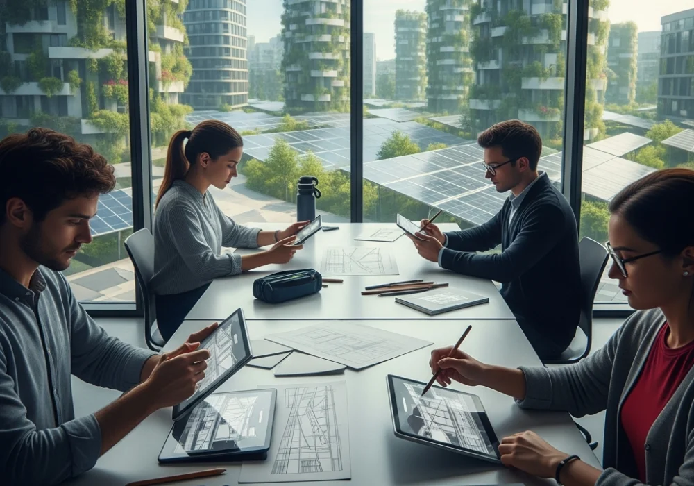
The Evolving Landscape of NID DAT 2027
As we approach the 2027 Design Aptitude Test (DAT), the National Institute of Design continues to shift its focus from mere technical sketching to deep cognitive evaluation. The designer of 2027 is expected to be more than a visual artist; they must be a system thinker, an ethical technologist, and a social innovator. This mock test is meticulously designed to mirror these upcoming shifts. We have integrated core concepts like Generative AI collaboration, the circular economy, and inclusive design for aging populations—topics that are projected to dominate the 2027 entrance paper. For students at www.myentrance.in, mastering these multifaceted problems is the key to securing a top rank. This test goes beyond traditional perspective drawing to challenge your understanding of how design impacts the global ecosystem and local communities. Prepare to think critically, analyze deeply, and visualize solutions that bridge the gap between technology and human empathy. Success in NID 2027 requires a blend of cultural awareness and futuristic foresight.
💡 Pro-Tip for 2027 Aspirants
Don’t just practice drawing objects; practice drawing relationships. In 2027, the NID examiners will likely ask you to visualize how a smart device interacts with an elderly user or how a waste-management system connects a city to its outskirts. Focus on ‘User-Journey’ sketches!
Section A: Analytical and Design Thinking
Select the most appropriate answer for the following 15 questions. Each question is crafted to test your observational and predictive design skills.
- Question 1: With the rise of the ‘Metaverse’ and spatial computing by 2027, which design principle becomes most critical for digital interfaces?
A) Skeuomorphism
B) Affordance in 3D Space
C) 2D Grid Alignment
D) High-Contrast Color Palettes - Question 2: In the context of Sustainable Product Design, what does ‘Cradle-to-Cradle’ signify?
A) A product that is donated after use
B) A linear lifecycle from raw material to landfill
C) A biomimetic approach to the design of systems where materials are treated as technical or biological nutrients
D) Reducing the weight of packaging materials by 50% - Question 3: Which color is predicted to be a ‘Key Trend’ for 2026-2027, reflecting a balance between digital reality and wellness?
A) Electric Crimson
B) Digital Lavender
C) Industrial Grey
D) Neon Yellow - Question 4: The ’15-minute city’ urban planning concept primarily focuses on:
A) Increasing the speed of public transport
B) Ensuring all essential human needs are within a 15-minute walk or cycle from home
C) Building skyscrapers within 15 minutes of city centers
D) Reducing internet latency in metropolitan areas - Question 5: Which emerging material is most likely to replace single-use plastics in the packaging industry by 2027?
A) Recycled Polyester
B) Mycelium-based composites
C) Aluminum alloys
D) Reinforced Carbon Fiber - Question 6: In visual semiotics, what does a ‘broken line’ in a diagram usually represent?
A) Strength and stability
B) Movement or an invisible boundary/projection
C) High speed and intensity
D) Finality and closure - Question 7: Designers often use ‘Inclusive Design’ to ensure products work for everyone. Which of the following is an example of ‘Permanent Disability’ in the context of interaction design?
A) A user holding a baby in one arm
B) A user with a broken arm in a cast
C) A user with only one arm
D) A user distracted by bright sunlight - Question 8: What is the primary purpose of ‘Haptic Feedback’ in modern wearable technology?
A) To increase the brightness of the screen
B) To communicate information through the sense of touch
C) To monitor the atmospheric pressure
D) To improve the audio quality of notifications - Question 9: The ‘Gestalt Principle’ of ‘Closure’ refers to:
A) The mind’s tendency to see complete figures even if a picture is incomplete
B) The ending of a design project
C) Grouping items that are close to each other
D) Aligning elements on a vertical axis - Question 10: Which of the following is a key characteristic of ‘Vernacular Architecture’ in India?
A) Use of imported glass and steel
B) Use of local materials and traditional techniques adapted to the climate
C) Modernist structures built by foreign architects
D) Standardized designs used across all states regardless of weather - Question 11: When designing an app for the Indian rural market, which factor is most crucial for UI/UX success?
A) High-fidelity 3D graphics
B) Heavy reliance on text-based menus
C) Iconography and voice-assisted navigation
D) Use of English as the primary language - Question 12: What does the term ‘Biomimicry’ refer to in the design of high-speed trains?
A) Painting the train to look like an animal
B) Using biological waste as fuel
C) Modeling the train’s nose after a Kingfisher’s beak to reduce noise and drag
D) Creating seats that feel like animal skin - Question 13: In the context of Typography, ‘Kerning’ refers to:
A) The space between lines of text
B) The space between individual letter pairs
C) The thickness of the letter strokes
D) The height of the capital letters - Question 14: Which Indian state is famous for the ‘Kanjeevaram’ silk weaving craft cluster?
A) Kerala
B) Tamil Nadu
C) Karnataka
D) Andhra Pradesh - Question 15: The psychological effect of the color ‘Blue’ in corporate branding is generally associated with:
A) Urgency and hunger
B) Trust, stability, and professionalism
C) Luxury and royalty
D) Energy and playfulness
Answer Key & Deep Explanations
Review the explanations below to understand the logic required for NID-level thinking. These insights help build the conceptual foundation needed for the DAT 2027.
1. Answer: B (Affordance in 3D Space). In a spatial computing environment (like AR/VR), users interact with depth. Affordance refers to the visual cues that tell a user how to use an object. In 3D, this means designing objects that look ‘grabbable’ or ‘pushable’ in a three-dimensional environment, which is far more complex than 2D button design. This will be a core focus as we transition from screens to immersive spatial experiences by 2027.
2. Answer: C (A biomimetic approach…). ‘Cradle-to-Cradle’ (C2C) is a framework that seeks to create systems that are not only efficient but also essentially waste-free. In this model, every output of a process becomes an input for another. For NID, understanding this is vital because 2027 design prompts will likely ask for solutions that eliminate the concept of ‘waste’ entirely, focusing on circularity rather than just recycling.
3. Answer: B (Digital Lavender). Forecasting agencies like WGSN have highlighted Digital Lavender as a color that represents wellness and digital escapism. It is a gender-neutral, calming hue that bridges the gap between the virtual and physical worlds. In the DAT, you may be asked to choose a color palette for a mental health app or a futuristic wearable; knowing these trends demonstrates your industry awareness.
4. Answer: B (Ensuring all essential needs…). The 15-minute city is a direct response to urban sprawl and climate change. It emphasizes decentralized living where work, shopping, education, and healthcare are within a short walk/ride. NID examiners look for your ability to design for community-centric models rather than just individual products, making urban sociology a hot topic for 2027.
5. Answer: B (Mycelium-based composites). Mycelium (the root structure of mushrooms) is a revolutionary bio-material that is biodegradable, fire-resistant, and compostable. As design shifts towards ‘Bio-fabrication,’ understanding how living organisms can grow into products is essential. This topic links biology with industrial design, a cross-disciplinary area NID loves to explore.
6. Answer: B (Movement or an invisible boundary). In design sketching and technical drawing, line weights and styles carry specific meanings. A broken or dashed line indicates something that is not physically present but is implied, such as a hidden edge, a trajectory of movement, or a projection. Mastering these visual shorthand symbols is critical for the sketching section of the DAT.
7. Answer: C (A user with only one arm). Inclusive design distinguishes between permanent, temporary, and situational disabilities. A permanent disability is a long-term physical condition. By designing for the permanent (e.g., someone with one arm), you automatically create solutions that help the temporary (someone with a broken arm) and the situational (a parent holding a baby). This ‘Persona’ based thinking is key for NID’s social design questions.
8. Answer: B (To communicate information through touch). As screens become cluttered, haptics (vibrations, pulses) offer a non-visual way to communicate. For example, a smartwatch can give a specific vibration pattern for a left turn vs. a right turn. In 2027, ‘Eyes-free’ interaction will be a major design challenge, and haptic feedback is the primary tool to solve it.
9. Answer: A (The mind’s tendency to see complete figures). The Law of Closure is a Gestalt principle where the brain fills in missing information to create a whole image. Think of the WWF panda logo. NID tests your ability to use these psychological shortcuts in logo design and visual communication to create clever, minimalist, and memorable imagery.
10. Answer: B (Use of local materials…). Vernacular architecture is design by the people, for the people, using what is available. In India, this includes Bhungas in Kutch or Houseboats in Kerala. NID places immense value on indigenous knowledge. Expect questions that ask you to adapt traditional cooling methods (like Jaali work) into modern sustainable product designs.
11. Answer: C (Iconography and voice-assisted navigation). To bridge the digital divide in rural India, designers must account for varying literacy levels. Visual icons and voice commands are more accessible than complex text menus. This ‘Bharat-centric’ design approach is a recurring theme in NID entrance exams, focusing on empathy for the ‘next billion’ users.
12. Answer: C (Modeling the train’s nose after a Kingfisher’s beak). This is a classic example of Biomimicry. The Shinkansen train used this design to solve the ‘tunnel boom’ problem. It shows how nature has already solved complex engineering problems. In the 2027 exam, you might be asked to observe an animal or plant and apply its functional logic to a human-made product.
13. Answer: B (The space between individual letter pairs). Unlike tracking (which adjusts the whole word), kerning is the meticulous adjustment of space between two specific letters to ensure visual balance (e.g., ‘A’ and ‘V’). For communication design aspirants, this level of detail is what separates a novice from a professional. It’s about ‘optical’ vs ‘mathematical’ spacing.
14. Answer: B (Tamil Nadu). Kanjeevaram sarees are from Kanchipuram, Tamil Nadu. NID’s GK section frequently covers Indian GI (Geographical Indication) tags and craft clusters. Knowing the origin, motifs (like temple borders), and techniques of Indian textiles is mandatory for anyone aiming for the Textile or Fashion Design disciplines.
15. Answer: B (Trust, stability, and professionalism). Color psychology plays a massive role in branding. Blue is the most popular color for banks and tech companies (like IBM or LinkedIn) because it evokes a sense of security and dependability. Understanding how colors manipulate human emotion is a core skill tested in the DAT’s creative sections.
Step into your Future as a Designer!
Preparing for NID 2027 is a journey of transforming how you see the world. If you found these questions challenging, remember that design is a muscle that grows with practice. At www.myentrance.in, we provide the tools, feedback, and community you need to excel.
Do you have questions about specific design streams or need more mock tests?
💬 Chat with our Experts on WhatsApp (+91 9526806124)