The Evolving Landscape of NID DAT: A Modern Perspective
The National Institute of Design (NID) Design Aptitude Test (DAT) has undergone a significant transformation to align with the dynamic needs of the global design industry. In the current syllabus, the focus has shifted from purely artistic skill to cognitive agility and digital awareness. Two specific modules—Creative Problem Solving and Mobile-Responsive Design—have emerged as critical components for candidates aiming to secure a seat in this prestigious institution. At myentrance.in, we understand these shifts and provide specialized mock tests to help you navigate these complex modules with confidence.
Understanding the Creative Problem Solving Module
Creative Problem Solving (CPS) is the heartbeat of the NID DAT. It is not just about finding an answer; it is about the process of identifying a challenge and ideating an innovative, human-centric solution. This module tests your ability to think beyond the obvious. Designers are essentially professional problem solvers who use empathy to understand user pain points.
The CPS Framework
- Empathize: Understanding the user’s environment and emotional state.
- Define: Clearly articulating the core problem based on observation.
- Ideate: Generating a wide range of diverse and unconventional solutions.
- Prototype: Representing the solution through sketches or structural diagrams.
By practicing with the mock tests on myentrance.in, students learn to apply frameworks like SCAMPER (Substitute, Combine, Adapt, Modify, Put to another use, Eliminate, Reverse) to everyday objects, which is a common task in the NID entrance exams.
The Digital Shift: Mobile-Responsive Design Modules
As the world moves toward a mobile-first digital economy, NID has introduced modules that test a candidate’s understanding of user interface (UI) and user experience (UX) design. Specifically, Mobile-Responsive Design focuses on how layouts adapt to different screen sizes and how users interact with handheld devices. You do not need to be a coder to excel here, but you must understand the principles of visual hierarchy and touch-target accessibility.
Key Principles of Mobile Design
- Visual Hierarchy: Using size, color, and contrast to guide the user’s eye to the most important elements.
- Navigation: Designing intuitive menus and buttons that are easy to tap with a thumb.
- Readability: Ensuring that typography is legible without zooming, regardless of the device.
- Constraint Management: Organizing content effectively within the limited real estate of a smartphone screen.
Comparing Creative Problem Solving and Mobile-Responsive Design
To help you understand the focus areas of these two modules, we have compiled a comparison table below. Both are essential for your NID DAT readiness.
| Feature | Creative Problem Solving | Mobile-Responsive Design |
|---|---|---|
| Primary Goal | Innovation and Social Impact | Usability and Digital Efficiency |
| Assessment Focus | Lateral Thinking and Empathy | Layout Logic and Visual Flow |
| Typical Task | Redesigning a kitchen tool for the elderly | Creating a wireframe for a travel app |
| Common Mistakes | Generic or cliché solutions | Overcrowded screens and poor spacing |
| Study Resource | MyEntrance.in Analytical Mock Tests | MyEntrance.in UI/UX Design Modules |
How to Prepare for the Upcoming NID DAT
Preparation for the NID DAT requires a blend of traditional sketching and modern design thinking. Here is a step-by-step strategy to master the latest pattern:
1. Build a Strong Observation Habit
Start looking at everyday objects and digital apps with a critical eye. Ask yourself why a button is placed where it is, or why a chair is shaped in a particular way. This habit is the foundation of the Creative Problem Solving module.
2. Master Grid Systems
For the Mobile-Responsive Design module, learn how grids work. Understanding how a 3-column layout on a desktop transitions to a 1-column layout on a mobile device is crucial. Sketch these transitions in your practice notebook.
3. Take Timed Mock Tests
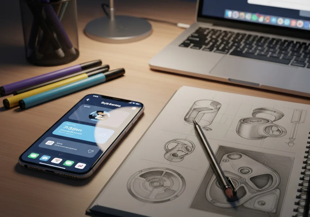
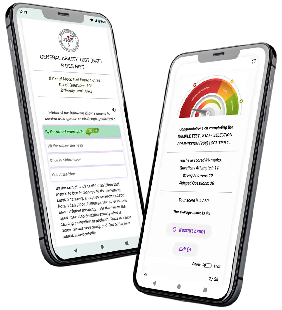
The NID DAT is as much about time management as it is about creativity. At myentrance.in, we offer a comprehensive suite of mock tests designed to simulate the actual exam environment. These tests cover the latest pattern, ensuring you are not surprised on the day of the exam.
Why Choose MyEntrance.in for Your NID Preparation?
Success in design entrance exams requires specialized guidance that generic coaching often lacks. Our platform, myentrance.in, provides curated study material and mock tests for NID DAT, NIFT GAT, and other competitive exams like Kerala PSC and SSC. Our content is updated to reflect current syllabus trends without cluttering your study plan with outdated information. By practicing with our mobile-responsive design modules and creative ideation sets, you gain the competitive edge needed to stand out among thousands of applicants.
Frequently Asked Questions (FAQ)
What is the most important skill for the NID Creative Problem Solving section?
The most important skill is empathy. You must be able to put yourself in the shoes of the user to identify their frustrations and needs before proposing a design solution.
Do I need to know graphic design software for the Mobile-Responsive Design module?
No, the NID DAT is a paper-based exam. You need to demonstrate your understanding of digital layouts and user flow through sketches and wireframes on paper, not through software like Photoshop or Figma.
How often should I take mock tests from myentrance.in?
We recommend taking at least two mock tests per week during your peak preparation phase. This helps in building speed and refining your conceptual clarity for both the DAT Prelims and Mains.
Are the NID and NIFT GAT patterns similar?
While there is some overlap in general ability and logical reasoning, NID focuses more on design thinking and subjective problem solving, whereas NIFT GAT leans toward business aptitude and communication. MyEntrance.in provides tailored tracks for both.
How can I improve my sketching for responsive design?
Focus on drawing clean geometric shapes and understanding icons. Practice drawing ‘wireframes’—simplified versions of mobile screens that use boxes and lines to represent images and text.