Table of Contents
- Why Color Theory Matters for NIFT CAT
- Understanding the Color Wheel: The Basics
- Technical Vocabulary: Hue, Tint, Tone, and Shade
- Essential Color Schemes for Design Success
- The Psychology of Color in Visual Communication
- Practical Application: Strategies for the NIFT CAT
- Common Mistakes to Avoid
- Frequently Asked Questions
- Quick Knowledge Check
Why Color Theory Matters for NIFT CAT
The National Institute of Fashion Technology (NIFT) Creative Ability Test (CAT) is designed to assess your intuition, imagination, and design aesthetic. Among all the skills tested, Color Theory is perhaps the most influential. It is not just about making a drawing look ‘pretty’; it is about communication, mood setting, and demonstrating a professional understanding of design principles.
When an examiner looks at your sheet, the colors you choose immediately signal your level of preparation. A student who understands how to balance warm and cool tones, or how to use high-contrast complementary colors for impact, will always outshine someone who applies color randomly. Mastering this subject is essential for scoring high in posters, product designs, and scene illustrations. At myentrance.in, we emphasize that technical color knowledge is the backbone of a successful design portfolio.
💡 Pro-Tip: The ’60-30-10′ Rule
In any design, aim for 60% of a dominant color, 30% of a secondary color, and 10% of an accent color. This creates a balanced and professional look that examiners love to see in the current exam pattern.
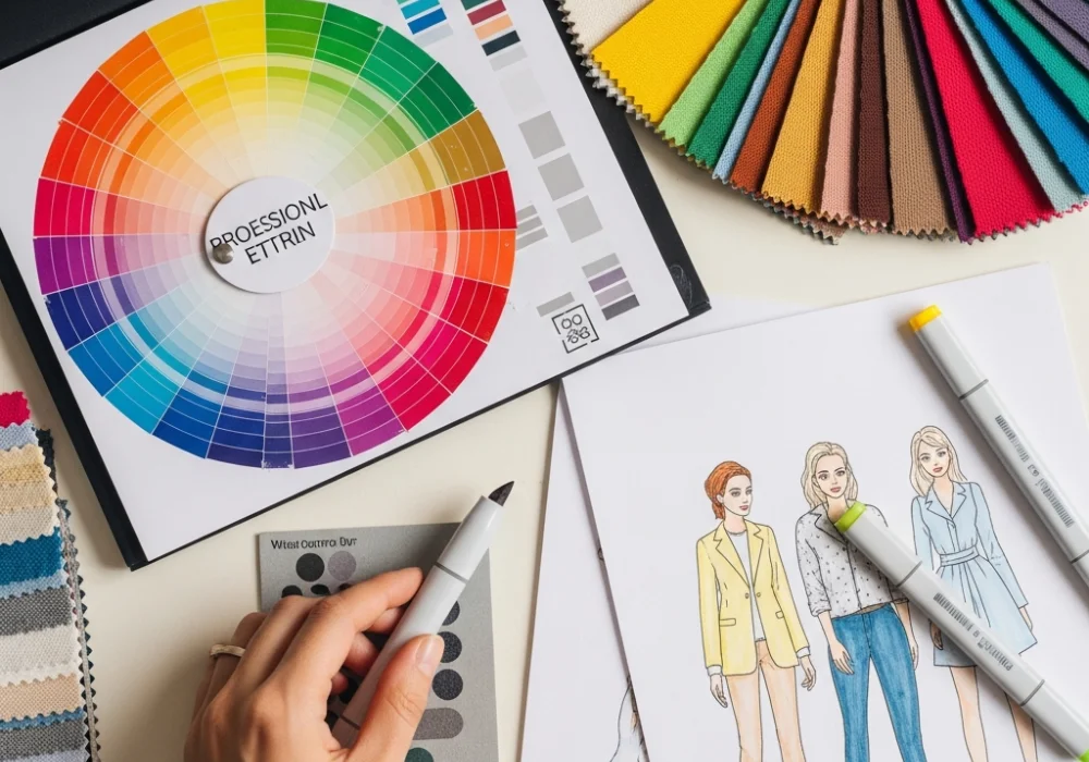
Understanding the Color Wheel: The Basics
The color wheel is your primary tool in the NIFT CAT. It organizes colors based on their relationships. To excel in the entrance exam, you must memorize the sequence and categories of the wheel.
Primary Colors
Red, Yellow, and Blue. These are the source of all other colors and cannot be created by mixing other pigments. In NIFT sketches, using primary colors creates a bold, high-energy impact, often seen in pop-art styles or children’s product designs.
Secondary Colors
Green, Orange, and Violet. These are created by mixing two primary colors in equal proportions. They offer a more balanced and natural feel to your illustrations.
Tertiary Colors
These are the intermediate colors like Red-Orange, Yellow-Green, or Blue-Violet. They are created by mixing a primary color with a neighboring secondary color. Tertiary colors are essential for adding sophistication and nuance to your NIFT submissions.
Technical Vocabulary: Hue, Tint, Tone, and Shade
To communicate your design choices effectively in the descriptive part of the NIFT CAT, you must use the correct terminology. Many students confuse these terms, but using them correctly can significantly boost your professionalism score.
- Hue: This refers to the purest form of a color (the name of the color itself, like ‘Blue’ or ‘Red’).
- Tint: A hue with White added. Tints are often described as ‘Pastels’ and are great for creating airy, soft, or youthful moods.
- Shade: A hue with Black added. Shades are used to create depth, mystery, or a sense of luxury.
- Tone: A hue with Gray added. Tones appear more muted and ‘sophisticated’, often used in contemporary fashion design illustrations.
By practicing with the mock tests available on myentrance.in, you can learn to apply these variations to give your work a 3D effect without needing complex shading techniques.
Essential Color Schemes for Design Success
A color scheme is a planned combination of colors. In the NIFT CAT, questions often ask you to illustrate a concept using a specific ‘color harmony’. Here are the most important ones:
1. Monochromatic
Uses variations of a single hue (tints, tones, and shades). This creates a highly unified and calming effect. It is perfect for questions involving ‘Peace’, ‘Solitude’, or ‘Professionalism’.
2. Analogous
Uses colors that are next to each other on the color wheel (e.g., Yellow, Yellow-Orange, and Orange). This scheme is found in nature and is very pleasing to the eye.
3. Complementary
Uses colors directly opposite each other on the wheel (e.g., Blue and Orange). This provides maximum contrast and is excellent for posters or designs meant to grab immediate attention.
4. Triadic
Uses three colors equally spaced around the wheel. This offers high contrast while maintaining harmony, resulting in a vibrant and balanced composition.
The Psychology of Color in Visual Communication
Every color evokes a specific emotion. The NIFT CAT often asks students to design for a specific mood or theme. Choosing the wrong color can ruin the impact of an otherwise great drawing.
| Color | Common Psychological Associations | Recommended Use in Exam |
|---|---|---|
| Red | Passion, Danger, Energy, Hunger | Sale posters, sports gear, alarms |
| Blue | Trust, Calm, Stability, Coldness | Corporate logos, water-themed products |
| Yellow | Happiness, Optimism, Caution | Summer themes, warning signs |
| Green | Growth, Nature, Health, Envy | Eco-friendly branding, organic foods |
| Purple | Luxury, Mystery, Spiritualism | Premium skincare, cosmic illustrations |
When tackling current pattern questions on ‘Cultural Diversity’ or ‘Abstract Emotions’, remember that these associations can vary, but staying within these standard professional guidelines ensures your design is understood by the evaluators.
Practical Application: Strategies for the NIFT CAT
How do you translate this theory into a high-scoring answer? Follow these three steps during your exam:
Step 1: Analyze the Keyword
Read the question carefully. Is the theme ‘Energy’ or ‘Tranquility’? For ‘Energy’, look at warm colors (red, orange). For ‘Tranquility’, look at cool colors (blue, green).
Step 2: Choose Your Scheme Early
Before you touch your markers or pencils, decide on your scheme. Stick to it throughout the drawing to maintain consistency. A common mistake is adding a random color halfway through that breaks the visual harmony.
Step 3: Test Your Mediums
Different mediums behave differently. Watercolors are great for soft gradients and monochromatic washes, while markers are excellent for high-contrast complementary schemes. Practice both using the study materials on myentrance.in to see which one suits your style better for the upcoming exams.
Common Mistakes to Avoid
Even talented artists fail the CAT because of simple color errors. Avoid these pitfalls:
- Over-saturation: Using too many bright colors without any neutral areas (white, gray, black) to rest the eyes.
- Poor Contrast: Putting light text on a light background. This is a major error in poster design questions.
- Ignoring the Background: Students often color the main object beautifully but leave the background white. A light tint in the background can tie the whole composition together.
- Muddy Colors: This happens when you mix too many colors together or layer wet paint over wet paint. Keep your colors clean and vibrant.
Frequently Asked Questions (FAQs)
Do I need to carry a physical color wheel to the exam?
No, you are not allowed to carry a color wheel. You must memorize it. A good practice is to lightly sketch a tiny color wheel in the corner of your rough work area as soon as the exam begins.
Which coloring medium is best for NIFT CAT?
Most toppers prefer a combination of color pencils and markers (like Copic or Ohuhu) for speed and precision. Watercolors are also acceptable but can be risky if the paper quality in the exam booklet is thin.
How much weightage does color have in the CAT?
While the exact marks aren’t disclosed, color and composition usually account for about 30-40% of the total score for an illustration question.
Quick Knowledge Check
Test your understanding of the concepts covered above!
1. Which color scheme uses colors that are directly opposite each other on the wheel?
💡 Click to Reveal Answer
Complementary Color Scheme.
2. Adding White to a pure hue creates a:
💡 Click to Reveal Answer
Tint.
3. Which color is most associated with ‘Luxury’ and ‘Mystery’?
💡 Click to Reveal Answer
Purple.
Ready to Ace Your NIFT Entrance Exam?
Get access to the most comprehensive mock tests, previous year papers, and expert design guidance. Join thousands of successful candidates today!
💬 Chat with our Experts on WhatsApp (+91 9526806124)