📌 Table of Contents
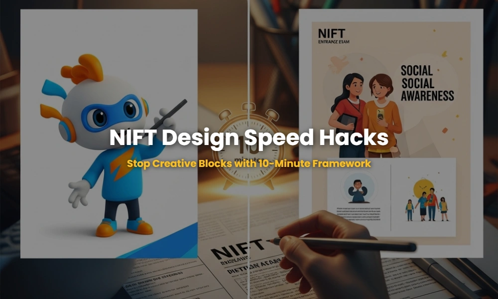
Are You Paralyzed by the NIFT Blank Page Syndrome?
The NIFT Creative Ability Test (CAT) is not a test of how well you can draw, but how fast you can think and communicate an idea. Most aspirants fail because they spend 40 minutes of a 3-hour exam just ‘thinking.’ This creative block is the #1 reason for incomplete papers and average scores. By mastering a structured brainstorming framework, you can cut your ideation time down to exactly 10 minutes, leaving you with ample time for high-quality rendering and detailing.
🚀 Key Takeaways
- The 10-Minute Rule: Allocate 2 minutes for analysis, 3 for ideation, and 5 for rough thumbnailing.
- M.A.P.S. Strategy: Use Mind-mapping, Attribute-listing, Perspective, and Symbolism to avoid blocks.
- Visual Hierarchy: Master the ‘Z’ and ‘F’ patterns to guide the examiner’s eye.
- Mascot Psychology: Learn to blend human traits with brand values instantly.
The Sneaky M.A.P.S. Framework You Cannot Afford to Ignore!
The M.A.P.S. framework is a professional design sequence used by top visualizers to generate unique concepts under high-pressure environments like the NIFT entrance exam. It focuses on breaking down a complex prompt into actionable design elements within a strict 10-minute window, ensuring you never face a creative block again.
Step 1: Mind Mapping (2 Minutes)
Write the central keyword of the question (e.g., ‘Pulse Polio’ or ‘Swachh Bharat’) in the center. Branch out with immediate associations: colors, shapes, emotions, and objects. This triggers lateral thinking and prevents you from choosing the most cliché idea that every other student will draw.
Step 2: Attribute Listing (3 Minutes)
If it’s a mascot, list physical traits (round, sharp, tall) and personality traits (friendly, aggressive, tech-savvy). For a poster, list the primary message (Call to Action) and the target audience. Defining these constraints early prevents ‘scope creep’ during the drawing phase.
💡 Pro-Tip: The ‘Why’ Method
Ask yourself ‘Why?’ for every element you add. If you can’t justify why a mascot is wearing a hat, remove it. NIFT examiners look for purposeful design, not just decoration.
The Mascot Design Secret: Anthropomorphism or Failure?
A mascot is a bridge between a brand/concept and the audience; in NIFT terms, this usually requires ‘Anthropomorphism’—giving human-like qualities to non-human objects. Whether you are designing a mascot for a ‘Water Conservation’ campaign or a ‘Tech Fest,’ the character must have a recognizable silhouette and a relatable emotion.
When designing a mascot, focus on the ‘Three C’s’: Core Shape (Circular for friendly, Triangular for dynamic), Color Palette (limited to 3-4 colors), and Communication (What is the mascot doing?). Use character design principles to ensure the mascot is memorable from a distance.
Common Pitfalls in Mascot Questions
Avoid making the mascot too complex. A mascot should be easily reproducible on a t-shirt, a badge, or a giant billboard. If your sketch has too many intricate patterns, it fails the scalability test that NIFT examiners subconsciously apply.
Is Your Poster Layout Boring? Use This Visual Magnet!
A winning NIFT poster design must have a clear visual hierarchy that guides the viewer’s eye from the headline to the illustration and finally to the Call to Action (CTA). Using the ‘Rule of Thirds’ or a ‘Radial Composition’ can make your poster stand out from the thousands of static, centered designs.
Typography is often the most ignored element in NIFT CAT posters. Instead of plain handwriting, create custom lettering that reflects the mood of the topic. For an environment-themed poster, use organic, flowing letters; for a sports theme, use slanted, bold, and blocky typography.
🧠 Hidden Quiz: Hierarchy Check
Look at your poster. What is the first thing you see? If it’s not the primary message, your hierarchy is broken. Adjust the size, weight, or color of the main element to fix this.
Mascot vs. Poster: The Critical Differences
Understanding the fundamental differences between these two question types is vital for NIFT success. While both require creative thinking, their execution goals are diametrically opposite.
| Feature | Mascot Design | Poster Design |
|---|---|---|
| Primary Goal | Brand Persona / Identity | Information / Awareness |
| Key Technicality | Anthropomorphism | Visual Hierarchy & Layout |
| Typography | Secondary (Usually just a name) | Critical (Headline/Slogan) |
| Composition | Centered / Character-focused | Multi-layered / Z-Pattern |
Don’t Get Disqualified! Your Burning Questions Answered
Every year, thousands of students lose marks due to simple technical errors in the NIFT CAT section. Here are the most frequently asked questions regarding mascot and poster design strategies.
Can I use a slogan in a mascot question?
While not always mandatory, a short, catchy name or slogan can add personality to your mascot. However, ensure it doesn’t overshadow the character illustration itself.
What colors should I use for a ‘Social Awareness’ poster?
Use color psychology. Red for urgency/danger, green for health/growth, and blue for trust. Avoid using too many colors as it can lead to visual clutter.
Is it okay to draw a realistic human as a mascot?
Generally, no. Mascots are stylized characters. A realistic human drawing is usually categorized as an ‘illustration.’ Focus on exaggeration and simplification for a true mascot.
Ready to Dominate the NIFT CAT?
Don’t let creative blocks ruin your design dream. Join our elite coaching programs and get personalized feedback on your sketches today!
💬 Chat with our Experts on WhatsApp (+91 9526806124)