Decoding the NID DAT: Sketching for Interaction vs Product Design
Welcome, aspiring designers! If you are preparing for the National Institute of Design (NID) Design Aptitude Test (DAT), you have likely realized that the exam does not just test your ability to draw pretty pictures. It tests your ability to think like a designer. One of the most common points of confusion for students is the difference between sketching for Interaction Design (IxD) and sketching for Product Design (PD). While both require a high level of visual communication, their focus, methodology, and end goals are vastly different. In this guide, we will analyze simulated questions based on trends from Previous Year Questions to give you the ultimate edge.
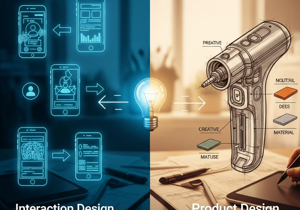
💡 Pro-Tip: The Core Difference
Product Design sketching is about physicality, ergonomics, and material reality. Interaction Design sketching is about behavior, time, and the flow of information. One captures a static or moving object, while the other captures a sequence of events.
Question 1: The Multi-Functional Kitchen Hub (Interaction Design)
Scenario: Design a digital interface for a communal kitchen appliance that helps five roommates manage their grocery sharing and cooking schedules. Show the main screen and the flow for adding a new grocery item.
The Traditional Method
Most students spend 20 minutes drawing a hyper-realistic 3D rendering of a tablet screen with shadows, gradients, and perfect icons. They focus on the aesthetic beauty of the screen but forget to show how a user actually navigates from point A to point B. This often results in a beautiful drawing that fails the ‘usability’ test of the NID examiners.
The 30-Second Ninja Shortcut: The Wireframe Flow
Instead of rendering, use Low-Fidelity Wireframes. Focus on the ‘Information Architecture’. Use a simple ‘User Journey Map’ consisting of three boxes: 1. Home Screen (Overview) -> 2. Action (Add Button) -> 3. Success State (Updated List). Use simple arrows to show the transition. This proves you understand the process of interaction, which is what the examiners are looking for in these Previous Year Questions.
💡 Click to Reveal the Secret Hack
Always include a ‘Thumb Zone’ analysis. Mention in a small note that buttons are placed at the bottom for easy reach. This small detail shows immense depth in Interaction Design thinking!
Question 2: The Ergonomic Handheld Tool (Product Design)
Scenario: Design an innovative handheld device for elderly gardeners to prune high branches without straining their wrists. Show the product in use and its main mechanism.
The Traditional Method
Students often draw a standard pair of scissors but slightly larger. They focus on the side view only. While the drawing might be clean, it lacks ‘Design Intelligence’. It doesn’t explain the material, the grip, or how the force is distributed.
The 30-Second Ninja Shortcut: The Exploded View & Ghosting
Use the ‘Ghosting’ technique. Draw the gardener’s hand in a light grey or faint pencil stroke (the ‘ghost’) and the product in dark, bold lines over it. This immediately shows the scale and ergonomics. Then, use an ‘Exploded View’ to show the internal spring mechanism. Label your materials (e.g., ‘Thermoplastic Elastomer for Grip’) to demonstrate technical knowledge common in Product Design tasks found in Previous Year Questions.
Question 3: Feedback Loops in Smart Objects (Interaction Design)
Scenario: You are designing a smart water bottle that reminds the user to hydrate. Sketch how the bottle communicates with the user when they have met 50% of their daily goal.
The Traditional Method
Sketching a smartphone app notification. This is the most basic answer. Examiners see thousands of these. It doesn’t use the ‘Physical-Digital’ interaction potential of the object itself.
The 30-Second Ninja Shortcut: Multi-Modal Feedback
Think beyond the screen. Use Visual, Auditory, and Haptic feedback. Sketch a 3-frame storyboard: 1. The bottle glowing a soft blue (Visual). 2. A subtle vibration pattern (Haptic). 3. A small e-ink display on the cap changing from a ‘droplet’ icon to a ‘half-full cup’ icon. Labeling these as ‘Multi-modal Feedback’ will make your answer stand out as an expert-level Interaction Design solution.
💡 Why Storyboarding?
In Interaction Design, a single drawing is a ‘state’, but a storyboard is a ‘story’. NID loves stories. Always use at least 3 frames for interaction tasks.
Question 4: Design for Disassembly (Product Design)
Scenario: Redesign a standard office stapler to be completely recyclable. Sketch the design and explain how it can be taken apart without tools.
The Traditional Method
Drawing a normal stapler and writing ‘Made of Recycled Plastic’ next to it. This doesn’t address the structural design problem. A stapler usually has metal pins and plastic bodies fused together, which makes recycling hard.
The 30-Second Ninja Shortcut: Snap-Fit Joints
Focus on the Joinery. Sketch a ‘Snap-Fit’ mechanism where the plastic parts click into each other without glue or screws. Use a ‘Zoom-in Circle’ (a magnifying glass effect) to show the detail of the clip. Use cross-hatching to differentiate between the metal anvil and the plastic body. This ‘Design for Disassembly’ approach is a high-scoring strategy for Product Design questions in the NID DAT.
Question 5: Public Information Kiosk (The Hybrid Task)
Scenario: Design a tourist information kiosk for a high-traffic railway station. Show both the physical form and the primary touch-screen interface.
The Traditional Method
Trying to fit everything into one drawing. The result is a messy sketch where the kiosk is too small to see the interface, and the interface is too small to see the buttons.
The 30-Second Ninja Shortcut: The 70/30 Split Rule
Divide your workspace. Devote 70% of the space to the Physical Form (Product Design) including details like ‘Anti-glare screen tilt’ and ‘Footrest for comfort’. Devote the remaining 30% to a Call-out Box showing the ‘User Interface (Interaction Design)’. Use a high-contrast ‘Home Screen’ design with large buttons for accessibility. This shows you can handle complex system-level thinking, which is the hallmark of a top-tier candidate.
Cheat Sheet: Quick Revision Formulas
| Feature | Interaction Design (IxD) | Product Design (PD) |
|---|---|---|
| Primary Focus | Flow, Time, Feedback | Form, Material, Ergonomics |
| Sketching Style | Storyboards, Wireframes | Perspective, Exploded Views |
| Key Elements | User Interface, Icons, Cues | C-curves, Joints, Textures |
| Deadly Mistake | Drawing a static screen only | Ignoring the human user |
Ready to Ace the NID DAT?
Cracking the NID entrance requires more than just practice—it requires the right strategy and guidance from those who have decoded the patterns of Previous Year Questions.
💬 Chat with our Experts on WhatsApp (+91 9526806124)