Mastering Color Theories: A Guide for NID Aspirants
Color theory is the backbone of visual communication. For students appearing for the National Institute of Design (NID) entrance exams, understanding the science and art of color is not just an advantage—it is a necessity. In the Design Aptitude Test (DAT), your ability to manipulate color to evoke emotion, define hierarchy, and create balance can be the difference between a good score and a great one.
Interactive: Color Harmony Matcher
Match the concept on the left with its definition on the right. Click one from each side!
The Foundation: Understanding the Color Wheel
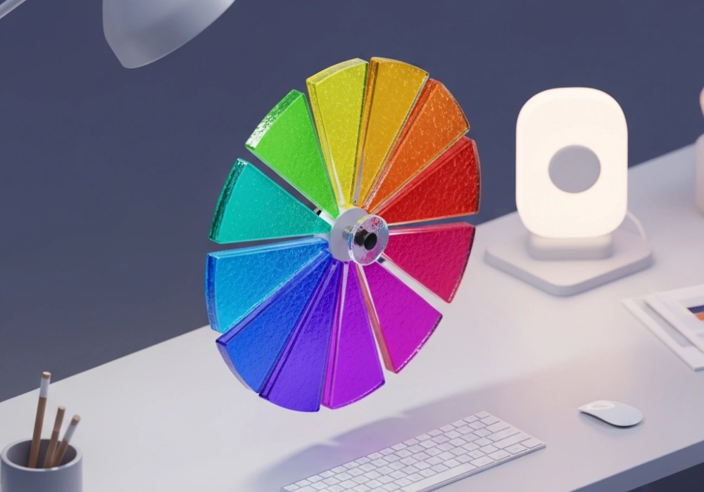
The color wheel is a circular diagram that represents the relationships between colors. It was first developed by Sir Isaac Newton in 1666. For designers, it is divided into three primary categories: Primary, Secondary, and Tertiary. Primary colors (Red, Yellow, Blue) cannot be created by mixing other colors. Secondary colors (Green, Orange, Purple) are formed by mixing primary colors. Tertiary colors result from mixing a primary and a secondary color, such as Blue-Green or Red-Violet.
Color Harmonies: Creating Visual Balance
NID questions often test your ability to create ‘harmony.’ This refers to the arrangement of colors in a way that is pleasing to the eye. Complementary colors create high contrast and high impact, often used to make elements stand out. Analogous colors are serene and comfortable, frequently found in nature. Triadic schemes offer a high degree of contrast while maintaining harmony, creating a vibrant look even when unsaturated. Understanding these relationships allows you to justify your color choices in your design portfolio or during the studio test.
Value, Hue, and Saturation
Designers don’t just use ‘blue’; they use a specific value and saturation of blue. Hue is the color itself. Value refers to the lightness or darkness (adding white for tints, black for shades). Saturation (or intensity) describes the brilliance or dullness of a color. In NID sketching, varying the value of a single color can create depth and three-dimensionality without the need for multiple hues.
The Psychology of Color in NID Exam
Color is psychological. Red can signify danger or passion, while Blue conveys trust and stability. In your NID DAT, if you are asked to design a logo for a hospital, choosing neon orange might be inappropriate. You must select colors that align with the brand’s message. Practice associating emotions with specific color palettes to speed up your decision-making process during the exam.
Expert Tips for the DAT
- Always carry a high-quality set of color pencils or markers.
- Practice ‘rendering’ simple shapes using a monochromatic scale to master light and shadow.
- Observe color palettes in successful branding around you to understand real-world applications.
- In the exam, explain your color choices if the question provides a space for a design brief.
Confused about Color Combinations?
Mastering design takes practice and guidance. Our experts are here to help you crack the NID code!
✠ Chat with our Experts on WhatsApp (+91 9526806124)