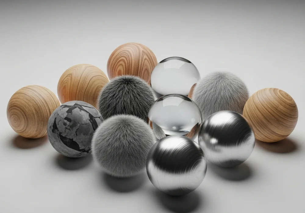
Understanding the Language of Surfaces
Texture is one of the most fundamental elements of design, yet it is often the most overlooked by design aspirants preparing for the National Institute of Design (NID) entrance examinations. At its core, texture refers to the surface quality of an object—how it feels to the touch or how it is perceived to feel visually. For an NID candidate, understanding texture goes beyond simple definitions; it involves the ability to translate sensory experiences into visual representations. During the Design Aptitude Test (DAT), you might be asked to render specific materials like rusted iron, silk, or weathered wood. Mastering these requires a keen eye for light, shadow, and pattern. There are two primary types of textures you must master: physical (tactile) and visual (implied). Physical texture is something you can actually feel, such as the grain of sandpaper or the softness of a cotton ball. Visual texture, however, is the illusion of those physical properties on a two-dimensional surface like paper or a screen.
In the world of design, texture serves multiple purposes. It adds depth, creates interest, evokes emotions, and can even influence the usability of a product. A smooth, glass-like finish on a smartphone conveys luxury and modernity, while a knurled grip on a heavy-duty tool suggests safety and control. In this interactive guide, we have curated twelve critical concepts regarding textures that frequently appear in NID theory questions and drawing challenges. By engaging with these flashcards, you will sharpen your vocabulary and conceptual understanding, helping you describe and utilize textures more effectively in your portfolio and exam sheets. Start by looking at each question, visualizing the answer in your mind, and then hovering over the card to reveal the expert explanation.
Pro-Tips for NID Texture Rendering
Perfecting your understanding of textures is a continuous process that requires both observation and practice. To excel in the NID exam, we recommend carrying a ‘texture journal’ where you record different surfaces you encounter daily. Try to sketch a square inch of a leaf, a piece of concrete, or a slice of bread. Focus on how the light hits the peaks and valleys of the surface. Remember, in the NID Studio Test, you may even be asked to manipulate physical materials like wire, clay, or paper to create specific textural effects. Understanding the theoretical side through these flashcards is the first step toward that mastery.
Texture doesn’t just exist in isolation; it works in tandem with color and form to tell a story. A ‘rough’ texture might signify age or resilience, while a ‘slick’ texture might signify speed. As you progress in your preparation, always ask yourself: why did the designer choose this specific texture? How does it change the way the user interacts with the object? By thinking critically about these elements, you elevate your design thinking from a hobbyist level to a professional NID standard. We hope this interactive challenge has boosted your confidence. Keep practicing your rendering techniques, stay curious about the world around you, and use these tools to build a winning design portfolio. For more resources, mock tests, and personalized feedback, explore the rest of MyEntrance.in. Your journey to a premier design institute starts with mastering the basics, and today, you have taken a significant step toward mastering the element of texture.
Need Help with Your NID Preparation?
Our design experts are here to help you crack the DAT and Studio Tests with ease!
💬 Chat with our Experts on WhatsApp (+91 9526806124)