Mastering Public Transit Rebranding: A Deep Dive into Color Psychology for NID DAT
The National Institute of Design (NID) Design Aptitude Test (DAT) frequently evaluates a candidate’s ability to solve complex, real-world problems through visual communication. One of the most sophisticated topics frequently explored in Previous Year Questions involves the rebranding of public utilities—specifically transit systems. Why? Because transit design requires a perfect marriage between aesthetics, psychology, and universal accessibility. To succeed at the NID DAT, you must move beyond ‘making things look pretty’ and start ‘making things work for everyone.’
The Critical Role of Color in Public Infrastructure
In the context of the NID DAT, color is never just a decorative choice. It is a functional tool. When we talk about rebranding a subway, a bus network, or a multi-modal transport hub, color serves three primary purposes: Information Hierarchy (what to look at first), Wayfinding (how to get from A to B), and Emotional Regulation (reducing the stress of commuting). Accessibility adds another layer of complexity, requiring designers to account for color vision deficiency (CVD), low vision, and cognitive differences.
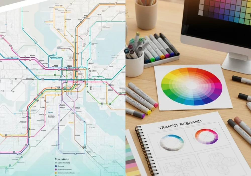
Question 1: The Multi-Line Metro Interchange Challenge
The Scenario: You are tasked with rebranding the signage for a massive underground interchange where four different lines (Red, Blue, Green, and Yellow) meet. Previous Year Questions often highlight that current commuters find the intersection confusing because the colors look too similar under artificial fluorescent lighting. Redesign the color palette to improve legibility for color-blind users while maintaining a vibrant brand identity.
The Traditional Method: Most students would simply pick brighter shades of Red, Blue, Green, and Yellow. They might try to add icons, but their primary focus remains on the ‘hue’ (the name of the color). This approach often fails because, under dim light or for a person with Protanopia, Red and Green might look like the same muddy brown.
The 30-Second Ninja Shortcut: The ‘Value-Gap’ Technique. Do not rely on hue alone. Squint your eyes at your color palette. If the colors blend into a similar shade of gray, they will fail in a real-world transit environment. Assign each line a distinct ‘Luminance Value.’ For example: Line A (Very Dark Navy), Line B (Medium Bright Orange), Line C (Very Light Mint), Line D (Neutral Grey-White). By varying the lightness and darkness (value) rather than just the color (hue), you ensure that even a person who sees no color at all can distinguish the lines based on contrast.
Question 2: Psychological De-escalation in High-Traffic Bus Terminals
The Scenario: A city’s central bus terminal is notorious for commuter anxiety and overcrowding. Based on themes from Previous Year Questions, design a harmonic color palette for the ‘Waiting Zones’ and ‘Boarding Gates’ to reduce heart rates and improve the flow of movement.
The Traditional Method: Students often choose ‘safe’ colors like Blue because they heard Blue is calming. They paint the whole wall blue, which can actually lead to a feeling of coldness or depression in a windowless terminal, making the space feel sterile and unwelcoming.
The 30-Second Ninja Shortcut: The ‘Biophilic Anchor’ Strategy. Use a 60-30-10 color rule based on nature. Use a grounding ‘Earth Tone’ (like Terracotta or Warm Sand) for 60% of the space to provide a sense of stability. Use a ‘Calming Cool’ (Sage Green or Dusty Teal) for 30% of the furniture and signage. Use a ‘High-Energy Signal’ (Soft Amber) for the 10% of areas where action is required (like ticket counters). This creates a balanced ‘Analogous Palette’ that feels natural and reduces the cognitive load on the brain.
Question 3: Rebranding for the Aging Population
The Scenario: A suburban rail system needs a rebrand to cater to an aging population with declining visual acuity (Yellowing of the crystalline lens). How would you adjust the harmonic palette of the primary wayfinding system?
The Traditional Method: Using high-fashion pastel palettes or sophisticated ‘muted’ tones. While beautiful, these colors have low ‘Chroma’ and blend together for elderly eyes, leading to dangerous navigation errors.
The 30-Second Ninja Shortcut: The ‘Complementary High-Contrast’ Hack. Avoid the ‘Blue-Violet’ end of the spectrum for critical information, as the aging eye struggles to see these short wavelengths. Instead, use high-contrast pairs like Black on High-Visibility Yellow or Deep Navy on White. Ensure a contrast ratio of at least 7:1. In your NID DAT sketch, emphasize the ‘halo’ effect—using a dark border around light-colored text to make it ‘pop’ against any background.
Question 4: Cultural Semantics in Rural-Urban Transit Links
The Scenario: You are designing the color identity for a new fleet of electric rickshaws connecting rural hubs to urban centers. Drawing from the logic of Previous Year Questions, how do you use color to signify ‘Safety’ and ‘Modernity’ without alienating the rural population?
The Traditional Method: Using ‘Tech-Blue’ and ‘Silver’ to look modern. In many Indian rural contexts, these can feel ‘Cold’ or ‘Government-issued,’ lacking a sense of community trust.
The 30-Second Ninja Shortcut: The ‘Hybrid Palette’ Concept. Combine a ‘Traditional Warmth’ (Marigold or Deep Saffron) with a ‘Modern Utility’ (Slate Grey or Clean White). The warm color provides cultural familiarity and high visibility in dusty environments, while the neutral slate grey provides the ‘Professional/Modern’ edge. This creates a harmonic ‘Split-Complementary’ look that feels both trustworthy and futuristic.
Question 5: Legibility at Speed—High-Speed Rail Identity
The Scenario: High-speed trains require passengers to identify their platform and coach within seconds. Design a color-coded system that remains legible even when the train is in motion or when a passenger is running.
The Traditional Method: Putting small color stickers or numbers on the doors. This requires the eye to focus on small details, which is difficult during rapid movement.
The 30-Second Ninja Shortcut: The ‘Super-Graphic’ Method. Use ‘Macro-Color Blocking.’ Instead of a small sign, the entire door or a massive vertical stripe on the carriage should be the identifier color. If a passenger knows they need the ‘Magenta Zone,’ they shouldn’t look for a word; they should look for a massive block of color. This utilizes ‘Peripheral Vision,’ which processes color and movement much faster than the ‘Foveal Vision’ used for reading text.
The Core Concept: Understanding Color Harmony for Accessibility
In the NID DAT, you must demonstrate knowledge of technical color terms. Use these in your design justifications:
- Monochromatic: Variations of a single hue. Best for creating a unified, sophisticated brand but risky for accessibility unless values are drastically different.
- Analogous: Colors next to each other on the wheel. Great for ‘Calm’ zones in transit hubs.
- Triadic: Three colors equally spaced. High energy and great for ‘Wayfinding’ where you need three distinct systems (e.g., Trains, Buses, Taxis).
- WCAG Standards: Mentioning ‘Web Content Accessibility Guidelines’ even in physical design shows the examiner you understand the mathematics of contrast.
Cheat Sheet / Quick Revision for NID DAT
| Concept | Application in Transit | Psychological Trigger |
|---|---|---|
| High Saturation | Emergency Exits / Alerts | Urgency, Attention |
| Low Saturation | Lounge / Rest Areas | Relaxation, Passive wait |
| Complementary Palette | Signage vs. Background | Maximum Legibility |
| Cool Tones (Blue/Green) | Navigational Paths | Trust, Flow, Logic |
| Warm Tones (Red/Orange) | Entry/Exit Points | Action, Energy, Greeting |
Quick Tips for the Exam Hall:
- Always carry a set of high-quality brush pens or markers to show vibrant ‘Spot Colors.’
- If asked to justify a color, use the word ‘Affordance’ (the quality of an object that allows an individual to perform an action).
- Always test your palette by imagining it in a ‘Grayscale’ photocopy—if the message is lost, the design is flawed.
Mastering these principles ensures that your design is not only visually stunning but also socially responsible. The NID DAT examiners are looking for designers who care about the elderly, the disabled, and the stressed commuter. Show them that you design with empathy and logic.
🚀 Ready to Ace your NID DAT Preparation?
Get personalized feedback on your design sketches, access more decoded Previous Year Questions, and join our exclusive mock test series.
💬 Chat with our Experts on WhatsApp (+91 9526806124)