The Importance of Color Theory in NIFT CAT
Success in the National Institute of Fashion Technology (NIFT) Creative Ability Test (CAT) often hinges on one’s ability to communicate complex ideas through visual language. While drawing skills and lateral thinking are critical, the strategic use of color is what truly brings a composition to life. Color theory is not just about choosing colors that look good together; it is a systematic study of how colors interact, how they influence human psychology, and how they can be used to direct a viewer’s eye. For design aspirants preparing for the latest pattern of entrance exams, mastering this subject is non-negotiable. At myentrance.in, we provide specialized mock tests that allow you to practice these concepts in a simulated exam environment.
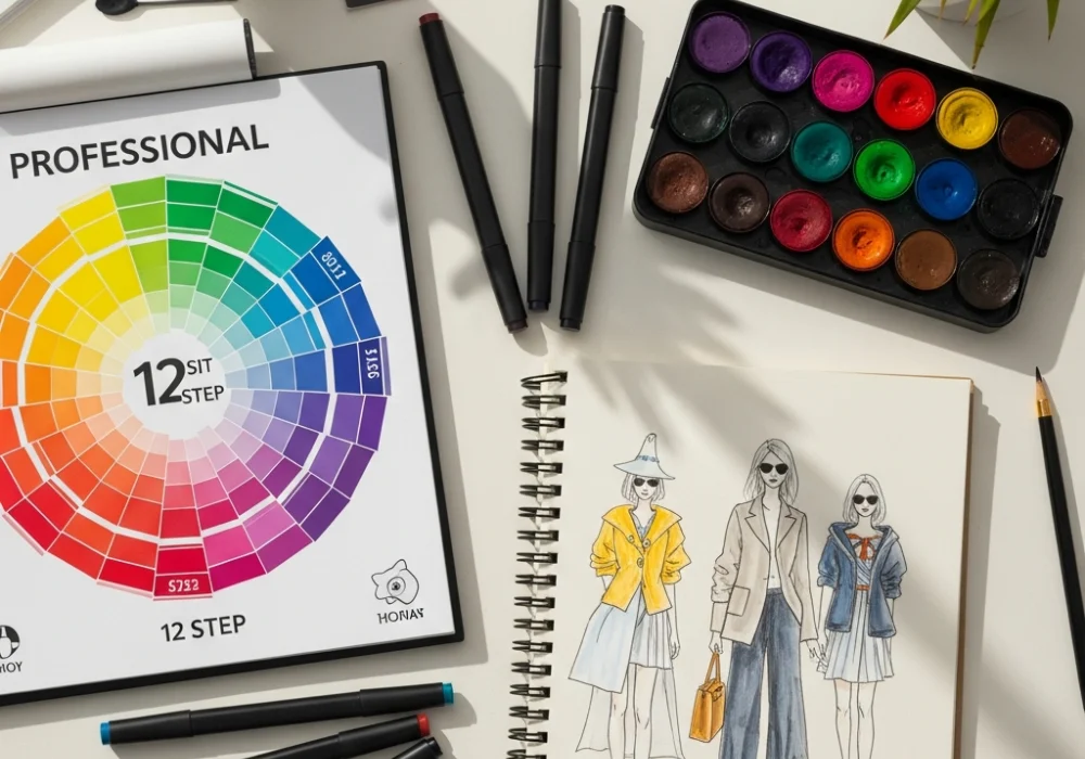
Understanding the Color Wheel
The foundation of all color theory is the color wheel. Originally developed by Isaac Newton and later refined by artists and scientists, the color wheel helps designers understand the relationships between different hues. For the NIFT CAT, you should be intimately familiar with the following categories:
- Primary Colors: Red, Yellow, and Blue. These cannot be created by mixing other colors and serve as the source for all other hues.
- Secondary Colors: Green, Orange, and Purple. These are formed by mixing equal parts of two primary colors.
- Tertiary Colors: These are created by mixing a primary color with its neighboring secondary color, such as Blue-Green or Red-Orange.
Key Color Harmonies for Design
Creating a balanced composition requires an understanding of color harmonies. These are pre-determined combinations that are aesthetically pleasing to the eye. In your NIFT CAT answer sheet, using these consciously can demonstrate your technical depth.
- Complementary Colors: Colors opposite each other on the wheel (e.g., Blue and Orange). They create high contrast and high impact.
- Analogous Colors: Colors located next to each other (e.g., Blue, Blue-Green, and Green). They offer a serene and comfortable design.
- Triadic Colors: Three colors evenly spaced around the wheel. This creates a vibrant look even when using pale or unsaturated versions of the hues.
- Split-Complementary: A base color plus the two colors adjacent to its complement. This provides high contrast without the tension of a pure complementary scheme.
Psychological Impact and Symbolism
In NIFT CAT questions, you are often asked to depict a specific mood or scenario, such as ‘Silence,’ ‘Chaos,’ or ‘Joy.’ Color is your primary tool for conveying these emotions. A design for ‘Global Warming’ would fail if it primarily used cool blues; it requires the aggressive, alarming heat of reds and oranges.
| Color | Psychological Association | Best Used For |
|---|---|---|
| Red | Passion, Danger, Energy, Hunger | Urgency, Posters, High-energy scenes |
| Blue | Trust, Calm, Professionalism, Sadness | Formal branding, Serene environments |
| Yellow | Happiness, Caution, Intellect | Highlighting elements, Joyful themes |
| Green | Nature, Growth, Envy, Peace | Sustainability, Health, Environmental topics |
| Purple | Luxury, Mystery, Spirituality | Creative concepts, Premium products |
| Black | Power, Elegance, Grief | Adding depth, Sophisticated outlines |
Advanced Concepts: Tint, Tone, and Shade
To add depth and realism to your design, you must move beyond pure hues. NIFT examiners look for students who understand how light and shadow affect color.
- Tint: Adding white to a color to make it lighter (Pastels).
- Shade: Adding black to a color to make it darker.
- Tone: Adding gray to a color to adjust its intensity or saturation.
By using tints and shades, you can create a 3D effect in your 2D drawings, making your illustrations for the upcoming exams stand out from the competition. Regular practice through mock tests on myentrance.in will help you refine your ability to choose the right tones under time pressure.
Practical Tips for the NIFT CAT Day
When you are in the examination hall, time management is as important as your creative skill. Here are some tips to keep in mind:
- Plan before you paint: Spend 5 minutes deciding your color palette before you touch your pencils or brushes to the paper.
- Test your colors: Always keep a rough sheet to test a color swatch. Once it is on your main sheet, it is difficult to change.
- Use Mediums Wisely: Whether you prefer color pencils, markers, or watercolors, ensure you are comfortable blending them to create smooth transitions.
- Contrast is King: Ensure there is enough contrast between your foreground and background so that your main subject is clearly visible.
Common Mistakes to Avoid
Many students make the mistake of using too many colors, which leads to a cluttered and confusing design. Stick to a maximum of 3 or 4 colors unless the question specifically asks for a multi-colored approach. Another mistake is ignoring the background. A white background can sometimes look unfinished; using a light wash or a subtle tone can make your main illustration pop. Practice with the latest pattern papers to understand how to balance your composition effectively.
Why Choose myentrance.in?
At myentrance.in, we understand the nuances of the NIFT Creative Ability Test. Our portal offers a comprehensive suite of mock tests designed by industry experts and NIFT alumni. These tests cover various aspects of CAT and GAT, ensuring you are well-prepared for any challenge the exam presents. From scenario sketching to color-based design problems, our platform is your one-stop solution for design entrance preparation.
Frequently Asked Questions (FAQ)
Which color medium is best for NIFT CAT?
Most students prefer a combination of color pencils and professional markers for speed and precision. Watercolors or poster colors can also be used if you are confident in handling them without making the paper soggy.
What is the weightage of color in the CAT section?
While there is no fixed percentage, color usage, aesthetics, and neatness generally contribute to about 30-40% of the total CAT score, as it reflects your design sense.
Do I need to follow the color wheel strictly?
The color wheel is a guide, not a rulebook. However, following established harmonies ensures your work is aesthetically pleasing. Breaking the rules should be a conscious design choice, not an accident.
How can I improve my color rendering?
Practice consistently. Look at real-life objects and notice how the light changes their color. Using the mock tests available at myentrance.in will also help you improve your speed and accuracy.
Can I use fluorescent colors in the exam?
It is generally advised to avoid fluorescent colors unless the theme specifically calls for it (like a neon party), as they can be distracting and may not scan/photograph well during evaluation.
Take Your Design Preparation to the Next Level!
Confused about your color palette? Need expert feedback on your sketches? Our team is here to help you crack the design entrance exams with ease. Get access to premium mock tests and personalized guidance today!
💬 Chat with our Experts on WhatsApp (+91 9526806124)